The Spring 2026 Color Trends Report and What to Actually Buy
Color shapes our emotional landscape in ways that extend far beyond simple aesthetic preferences. The hues surrounding us influence mood, energy levels, and even decision making processes. Understanding the 2026 color trends provides more than fashion guidance or decorating inspiration. It offers insight into collective cultural movements and practical direction for making purchasing decisions that remain relevant long after initial enthusiasm fades.
The 2026 color trends reveal a fascinating tension between boldness and restraint, vibrancy and calm. Major paint manufacturers, fashion houses, and trend forecasting services have released their predictions, and patterns emerge that tell compelling stories about where we find ourselves culturally. These are not arbitrary selections chosen for novelty. They reflect deeper currents in society including desires for authenticity, wellness, connection to nature, and escape from digital saturation.
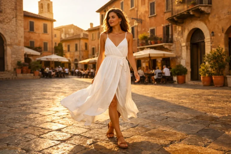
Spring 2026 specifically presents a palette that balances optimism with groundedness. After years dominated by safe neutrals and millennial greys, the pendulum swings toward colors that make us feel something genuine. The 2026 color trends for spring embrace nature inspired hues, energizing brights, and sophisticated jewel tones that work together rather than competing for attention. Understanding which colors dominate the landscape and how to incorporate them practically transforms trend awareness into actionable wardrobe and home decisions.
The Dominance of Warm Neutrals in 2026 Color Trends
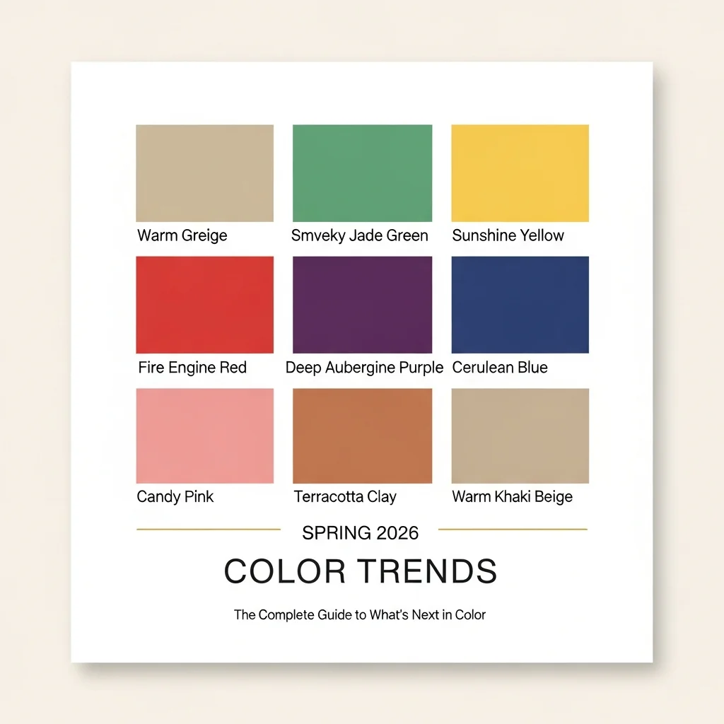
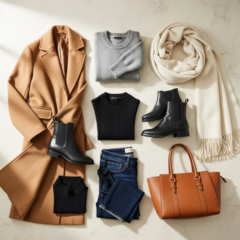
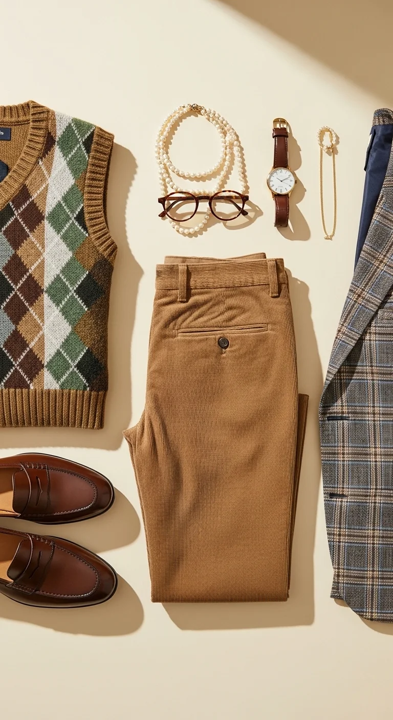
Warm neutrals continue their reign as the foundation of the 2026 color trends, though they evolve from previous interpretations. Cool greys that defined the past decade fade from prominence, replaced by warmer tones that create inviting rather than stark environments. Benjamin Moore selected Silhouette, a rich espresso blended with charcoal notes, as their Color of the Year. Sherwin Williams chose Universal Khaki, a sophisticated beige khaki hybrid. These selections signal movement toward colors that feel grounded and comforting.
The appeal of warm neutrals in the 2026 color trends extends beyond simple aesthetics. These colors provide emotional stability during uncertain times while offering versatile foundations that accommodate bolder accent choices. Mushroom taupe, soft stone, warm beige, and greige all fall within this category. They create backdrops that allow architecture, furnishings, and textures to shine without overwhelming spaces or outfits. Find more on Loewe SS26 Just Made a Serious Case for Primary Colors ideas
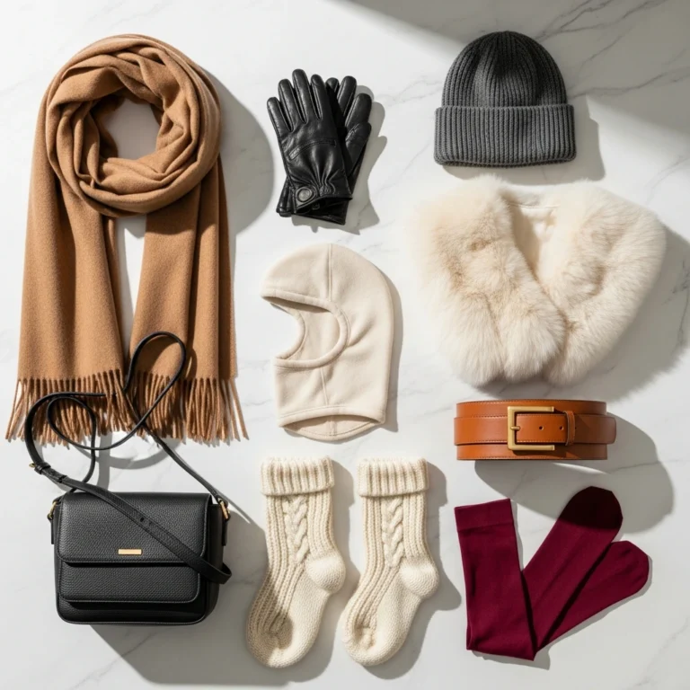
For practical application, warm neutrals from the 2026 color trends work beautifully in foundational wardrobe pieces. Invest in quality coats, trousers, and knitwear in these shades. A camel coat or greige cashmere sweater coordinates with virtually everything while feeling current. In home environments, these colors work well for larger furniture pieces and wall treatments, providing longevity that justifies investment. Pair warm neutrals with natural materials like wood, linen, and leather to enhance their organic feel.
Nature Inspired Greens Lead Spring 2026 Color Trends
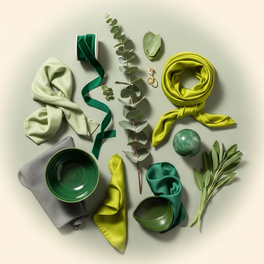
Earthy greens emerge as stars within the 2026 color trends, ranging from soft sage to rich emerald to vibrant chartreuse. Behr selected Hidden Gem, a smoky jade, as their Color of the Year, while Dunn Edwards chose Midnight Garden, a deep muted green. These selections reflect collective desire for nature connection, particularly as digital lifestyles disconnect us from outdoor environments. The calming properties of green make it particularly appealing for spaces designed for rest and restoration.
The spring 2026 color trends emphasize greens that feel organic rather than artificial. These are not the bright kelly greens of decades past but rather sophisticated tones pulled directly from forest canopies, desert sage, and mineral deposits. Fresh greens create immediate nature connections that calm nervous systems and reduce stress. Jewel toned emeralds add instant radiance while maintaining grounding qualities.
Incorporating greens from the 2026 color trends works across multiple applications. In fashion, emerald outerwear makes bold statements that remain sophisticated. Sage green knitwear offers versatility that pairs with both neutrals and other colors. For interiors, consider green in rooms where calm matters most including bedrooms and home offices. The color works beautifully with natural wood, brass hardware, and cream accents. Start with smaller commitments like throw pillows or accessories before committing to larger pieces if the color feels unfamiliar.
Bold Yellows Brighten the 2026 Color Trends
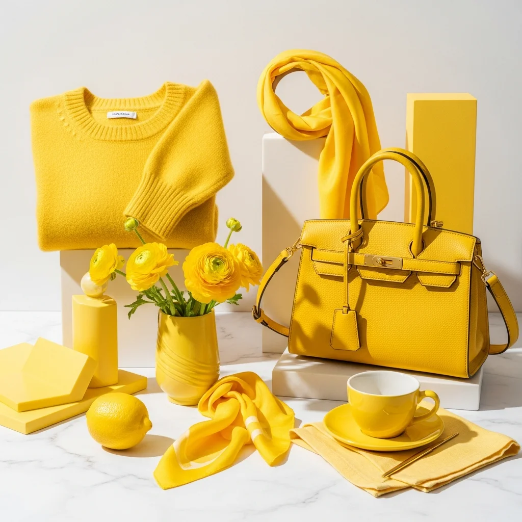
Sunshine yellow and its more intense cousin canary yellow dominate the spring fashion runways, signaling their prominence in the 2026 color trends. This represents an evolution from the butter yellow that saturated 2025. The new yellows feel more confident and energetic, less soft and whispered. Major fashion houses including Bottega Veneta, Loewe, and Tory Burch featured various yellow iterations prominently in their spring collections.
The psychological impact of yellow within the 2026 color trends cannot be overstated. This color stimulates mental activity, generates optimism, and creates feelings of joy. In times marked by uncertainty and stress, yellow offers antidote through its inherent cheerfulness. The shade works particularly well in spring contexts where increasing daylight and warming temperatures align with yellow’s sunny disposition.
Wearing yellow from the 2026 color trends requires some confidence, but accessibility increases through thoughtful styling. Start with yellow accessories including bags, shoes, or scarves if full garments feel overwhelming. Yellow knitwear in cashmere or cotton provides wearable entry points that layer well with denim and neutrals. Pair yellows with white, beige, or even contrasting orange for cohesive looks. In homes, yellow works beautifully in kitchens where morning light enhances its energizing properties. Use yellow in smaller doses through art, dishware, or accent chairs rather than committing to yellow walls if uncertain.
The Return of Fire Engine Red in 2026 Color Trends
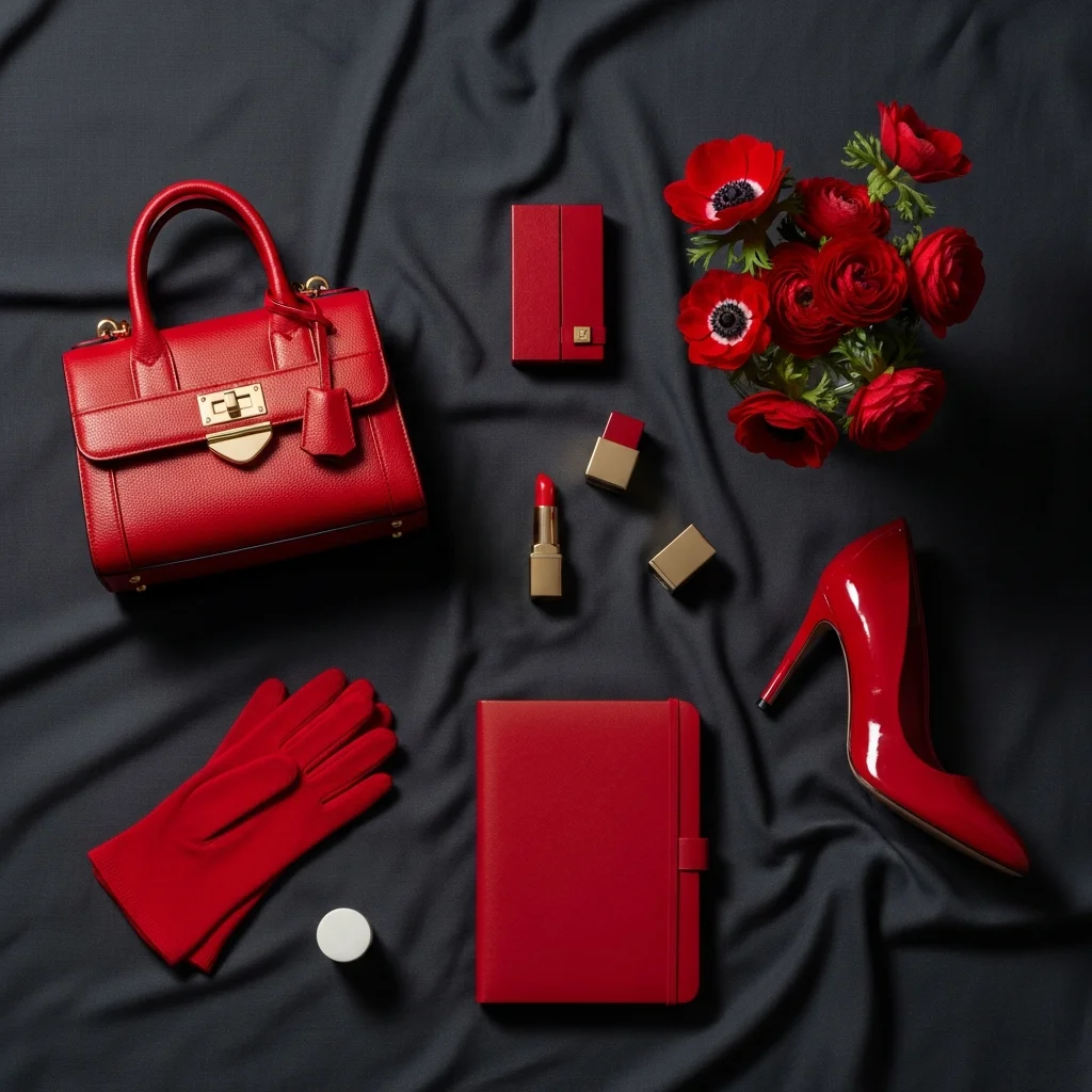
Red maintains its position within the 2026 color trends after strong showings in recent seasons. Fire engine red appeared prominently at Chanel, Valentino, and Stella McCartney spring shows. This particular shade of red feels powerful and confident, neither orange toned nor burgundy influenced. Pure, clean red makes statements that demand attention while conveying sophistication when styled properly.
Red within the 2026 color trends connects to themes of passion, energy, and boldness. The color increases heart rate and creates feelings of excitement. In fashion contexts, red communicates confidence and makes wearers memorable. The shade photographs beautifully, explaining its prevalence in runway presentations where visual impact matters enormously. Red also carries cultural associations with celebration, romance, and power across various societies.
Incorporating red from the 2026 color trends works through balanced approach. Pair bold red pieces with simple silhouettes and neutral bases so color provides the statement without overwhelming. A red blazer over white tee and dark denim creates classic combinations that feel fresh. Red accessories including bags, shoes, or scarves add personality to neutral outfits without requiring full commitment. For interiors, red works well as accent color through artwork, textiles, or small furniture pieces. Avoid red in bedrooms where its stimulating properties interfere with rest, focusing instead on living areas and entryways. find related content here.
Sophisticated Purples and Burgundies in 2026 Color Trends
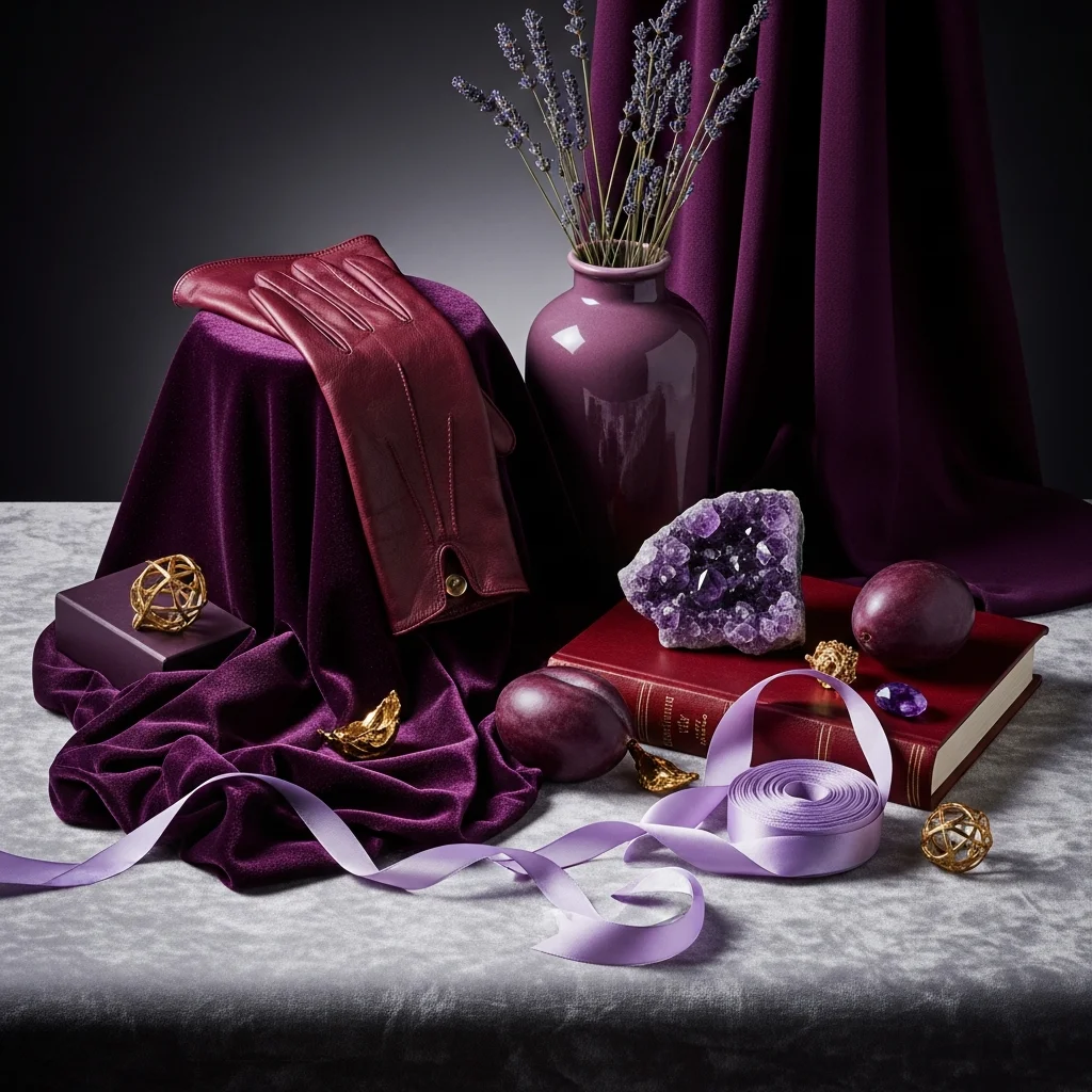
Purple emerges as unexpected star across the 2026 color trends, appearing in various iterations from soft lavender to deep aubergine. Fashion data shows purple dominated runways from New York to Paris, with designers including Jil Sander, Saint Laurent, and numerous others featuring the shade prominently. Little Greene selected Adventurer, a regal plum, as their Color of the Year. These burgundy and purple tones feel luxurious and mysterious while offering calming properties.
The prominence of purple in the 2026 color trends reflects movement toward colors that feel rich and complex rather than simple and safe. Purple historically associates with wealth, creativity, and spirituality. The color occupies unique position on the spectrum, blending warm and cool tones that work across seasons. Deeper purples feel particularly relevant for spring when paired with lighter complementary shades.
Wearing purple from the 2026 color trends offers more accessibility than initially apparent. Burgundy and wine tones work beautifully in leather goods, knitwear, and outerwear. Softer lavenders appear in shirting and dresses that feel romantic without being overly sweet. Purple pairs wonderfully with grey, cream, and sage green. For interiors, purple works well in spaces designed for creativity and relaxation. Consider purple in reading nooks, creative studios, or powder rooms where boldness feels appropriate without overwhelming daily living spaces.
Cerulean Blue Joins the 2026 Color Trends
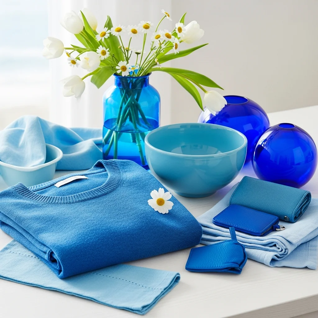
Cerulean blue gains prominence within the spring 2026 color trends as fashion embraces primary colors with renewed enthusiasm. This particular shade of blue sits between sky blue and true blue, offering vibrancy without the intensity of cobalt. The color feels optimistic and expansive, reminiscent of clear skies and tropical waters. Its appearance across multiple runway shows signals staying power beyond single season relevance.
Blue generally ranks as globally favored color, making cerulean’s prominence in the 2026 color trends particularly accessible. The shade works across diverse contexts from casual to formal, making it versatile foundation for multiple purchases. Cerulean blue also photographs beautifully and pairs well with the other trending colors including yellows, greens, and neutrals. The color creates freshness that feels appropriate for spring without being seasonally limited.
Incorporating cerulean from the 2026 color trends works through varied approaches. The color excels in shirting, knitwear, and outerwear where it provides statement without overwhelming. Cerulean accessories including bags and shoes offer personality injection into neutral wardrobes. The shade pairs beautifully with white, cream, and soft grey for cohesive combinations. In interiors, cerulean works well in spaces benefiting from calm energy including bedrooms and bathrooms. The color also succeeds in children’s spaces where its playful yet sophisticated nature appeals across age ranges.
Candy Pink Evolves Within 2026 Color Trends
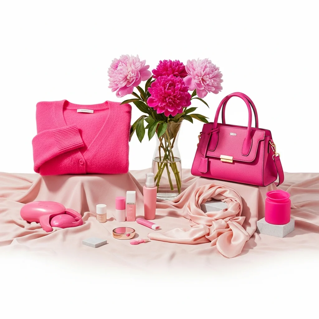
Pink maintains presence in the 2026 color trends though it evolves from the powder pink that dominated 2025. The new iteration leans sweeter and more vibrant, earning descriptions including candy pink and millennial pink revival. Fashion houses including Stella McCartney, Patou, and Blumarine featured various pink interpretations in spring collections. This shift toward brighter pinks signals growing color confidence and desire for shades that spark joy.
Pink within the 2026 color trends offers interesting psychological properties. The color creates feelings of compassion, nurturing, and playfulness. Brighter pinks feel youthful and energetic while maintaining sophistication through proper styling. The shade works particularly well in spring contexts where it aligns with blooming flowers and increasing warmth. Pink also photographs exceptionally well, contributing to its social media prevalence.
Wearing pink from the 2026 color trends requires moving past any preconceptions about the color being too feminine or juvenile. Modern pink applications feel sophisticated and intentional. Consider pink in unexpected categories including outerwear, tailored pieces, and accessories. Pink pairs beautifully with grey, cream, and navy for balanced combinations. Mixing pink with other trending colors including green or yellow creates fresh unexpected pairings. For interiors, pink works well in spaces benefiting from warmth and softness. Use pink in bedrooms, dressing areas, or home offices where its nurturing properties enhance daily experience.
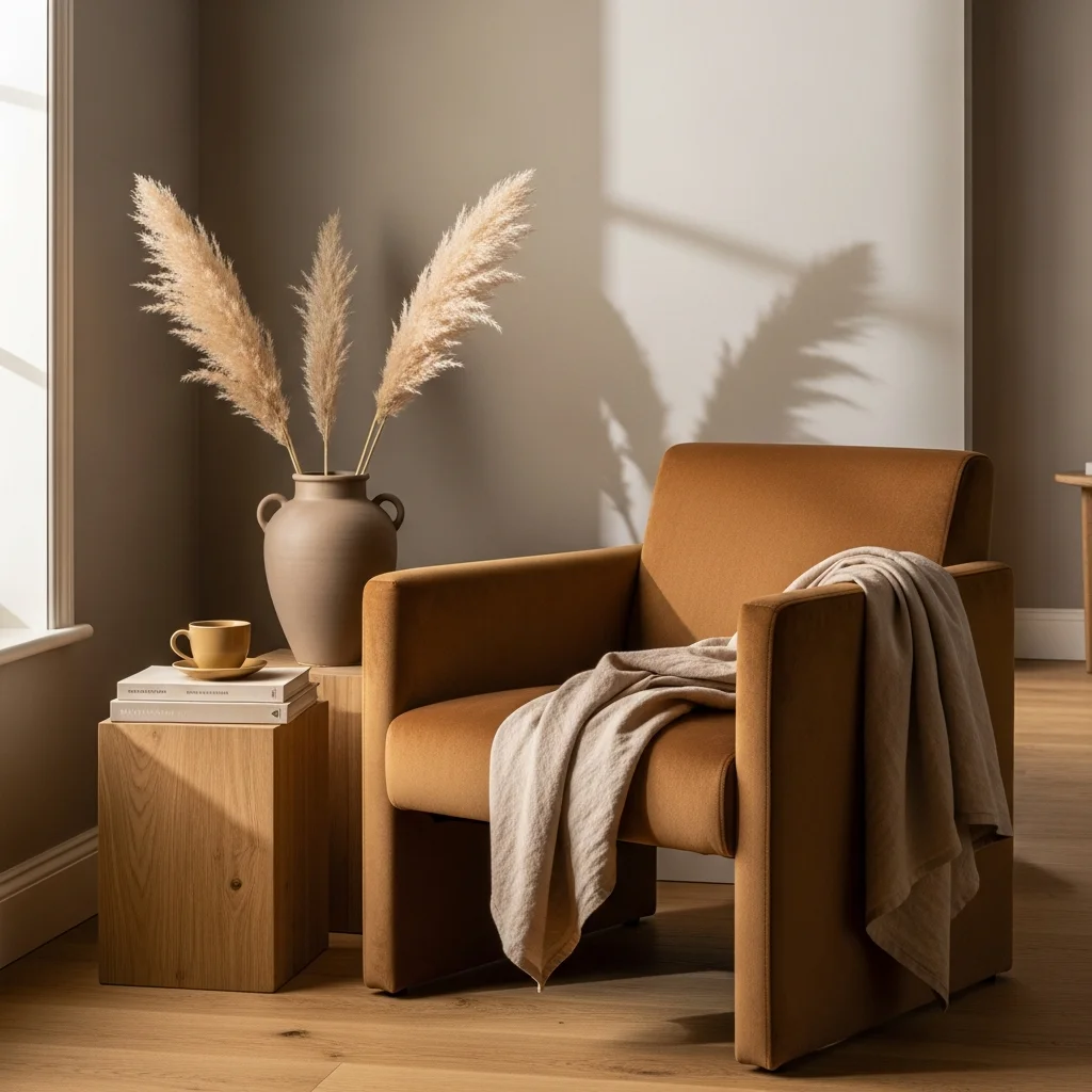
Desert and Clay Tones Ground the 2026 Color Trends
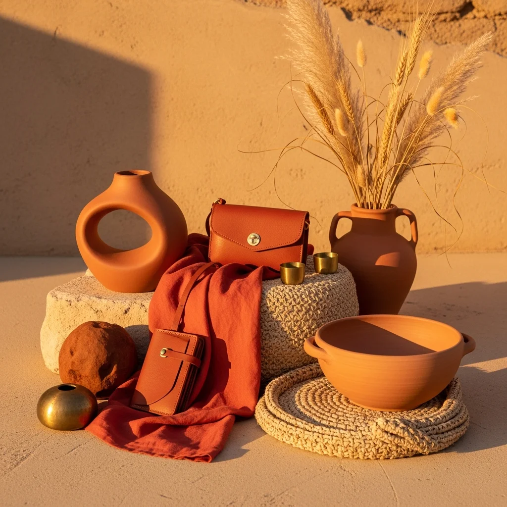
Terracotta, clay, and desert inspired tones provide grounding elements within the 2026 color trends. These sunbaked earth colors feel warm and serene while encouraging connection to natural landscapes. The palette includes burnt coral, rust orange, warm terracotta, and sandy beige. These colors work beautifully in Southwestern and Mediterranean design contexts but translate across diverse aesthetic approaches through their inherent versatility.
The appeal of desert tones in the 2026 color trends connects to broader wellness movements and desires for grounding during chaotic times. These colors evoke stability, warmth, and ancient wisdom. They pair exceptionally well with the warm neutrals and greens also trending, creating cohesive palettes that feel intentional. Desert tones also work across seasons, providing investment value through year round relevance.
Incorporating desert tones from the 2026 color trends works through varied applications. Terracotta and rust work beautifully in leather goods, footwear, and accessories. Clay tones appear in knitwear and outerwear that feel organic and timeless. These colors pair wonderfully with cream, sage, and warm brown for earthy combinations. In interiors, desert tones create warmth without darkness. Consider these shades for textiles including rugs, throws, and pillows where they add richness without permanent commitment. The colors also work beautifully in pottery, artwork, and natural material accessories.
Strategic Shopping for 2026 Color Trends
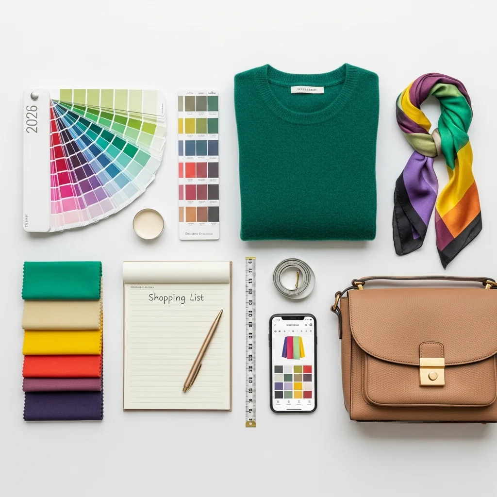
Understanding the 2026 color trends provides foundation for making intelligent purchases that remain relevant beyond immediate season. Focus on acquiring colors in quality pieces that serve multiple purposes and coordinate with existing wardrobes and homes. Not every trending color deserves equal investment. Prioritize colors aligning with personal preferences and lifestyle needs rather than chasing every trending shade.
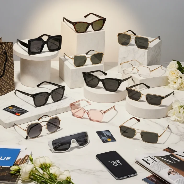
For wardrobe building, invest in trending colors for foundational pieces that receive regular wear. A quality coat in emerald green or a cashmere sweater in warm neutral provides better long term value than trendy accessories in colors that feel forced. However, accessories offer excellent entry points for experimenting with bolder trending colors including yellows, reds, and purples. Bags, shoes, and scarves allow color injection without requiring full outfit commitments. Approach a detailed guide here.
In home contexts, use trending colors strategically based on commitment levels. Paint offers relatively inexpensive and reversible option for incorporating trends, particularly in smaller spaces or accent walls. Larger furniture investments should focus on timeless colors that transcend trends, using trending shades through easily changeable elements including pillows, throws, artwork, and accessories. This approach allows refreshing spaces regularly without requiring expensive overhauls.
Conclusion
The 2026 color trends tell stories about collective desires for authenticity, wellness, nature connection, and emotional engagement. Spring palettes balance optimism through vibrant yellows, reds, and purples with grounding through warm neutrals, earthy greens, and desert tones. These colors work together rather than competing, creating cohesive palettes that accommodate diverse personal styles and contexts.
Successfully navigating the 2026 color trends requires moving beyond simple trend following toward thoughtful selection based on personal resonance and practical application. Not every trending color belongs in every wardrobe or home. The most successful approaches involve identifying which colors genuinely enhance daily life while coordinating with existing possessions and future goals. Quality matters more than quantity, with fewer well chosen pieces in trending colors delivering better value than numerous poorly considered purchases.
The 2026 color trends ultimately provide permission to embrace colors that make us feel something real. After years of playing it safe with endless neutrals, the cultural moment encourages bolder choices that reflect individual personalities while connecting to broader movements toward wellness and authenticity. Whether through a single statement piece in canary yellow or complete room transformation in smoky jade, engaging with these trends offers opportunity to refresh environments and wardrobes in ways that genuinely improve daily experience.
Frequently Asked Questions
What are the most important colors in the 2026 color trends?
The most significant colors include warm neutrals like greige and warm beige, nature inspired greens ranging from sage to emerald, bold yellows including canary and sunshine yellow, fire engine red, sophisticated purples and burgundies, cerulean blue, and desert tones including terracotta and clay. These colors balance bold statements with grounding neutrals, reflecting cultural desires for both optimism and stability.
How do I incorporate 2026 color trends without looking dated next year?
Focus on trending colors in quality foundational pieces that transcend single season relevance. Invest in colors like emerald green or warm neutrals for coats and core wardrobe items. Use bolder trending colors including yellows and purples through accessories and easily changed elements. Avoid trendy colors in expensive permanent installations. Choose colors you genuinely love rather than forcing trending shades that feel unnatural to your style.
Which 2026 color trends work best for small spaces?
Warm neutrals including greige, soft beige, and warm khaki work beautifully in small spaces by creating expansive feelings without coldness. Soft blues and sage greens also succeed in compact areas through their calming properties. Use bolder trending colors including yellows and reds as accents rather than dominant shades in small spaces. Consider color drenching techniques with lighter trending shades to create cohesive environments that feel larger.
Can I mix multiple 2026 color trends together?
The 2026 color trends work harmoniously when combined thoughtfully. Pair warm neutrals with any trending color as foundation. Combine nature inspired greens with desert tones for earthy palettes. Mix yellows with blues for energetic primary color schemes. Purple pairs beautifully with sage green and warm grey. Avoid combining too many bold trending colors simultaneously, instead balancing one statement shade with neutrals and one complementary accent color.
Are the 2026 color trends suitable for professional environments?
Many 2026 color trends work excellently in professional contexts. Warm neutrals, deep greens, burgundy, and cerulean blue all convey sophistication appropriate for business settings. Use these colors in tailored pieces including blazers, trousers, and quality accessories. Reserve brighter yellows and reds for creative industries or as subtle accents through accessories. The key lies in balancing trending colors with classic silhouettes and quality materials that maintain professional appearance.
One Comment