

Loewe SS26 Just Made a Serious Case for Primary Colors ideas
Loewe SS26 Just Made a Serious Case for Primary Colors Ideas
The fashion world held its breath as Jack McCollough and Lazaro Hernandez stepped into one of the most scrutinized roles in contemporary fashion. Their debut collection for Loewe SS26 during Paris Fashion Week marked not just a changing of the guard but a bold declaration that primary colors deserve a renaissance in luxury fashion. After Jonathan Anderson’s celebrated eleven year tenure at the Spanish house, the former Proenza Schouler founders faced towering expectations. What they delivered was a masterclass in how simplicity, when executed with precision and conviction, can feel revolutionary.
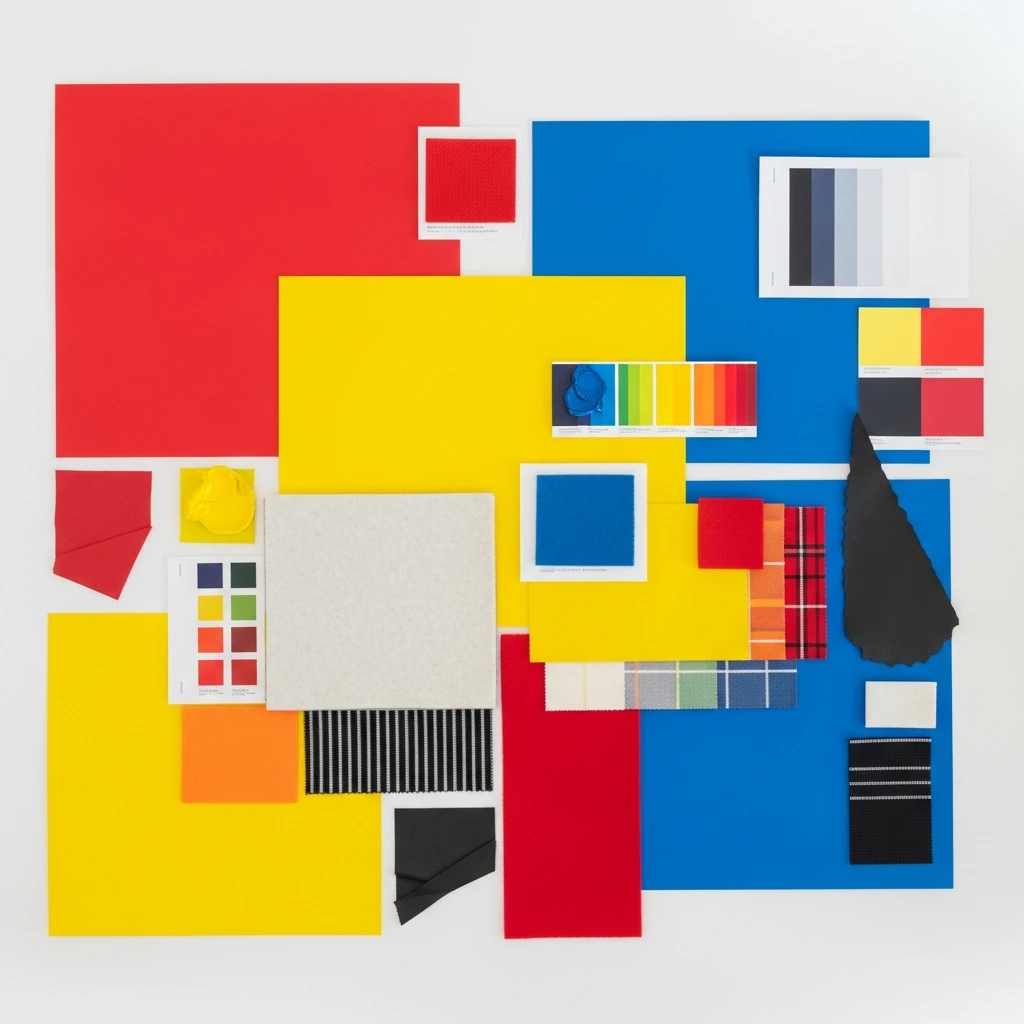
The Spring Summer Loewe 2026 collection arrived with an unmistakable visual language. Red, yellow, and blue dominated the runway with an intensity that felt both nostalgic and urgent. These weren’t the muted, dusty iterations that often populate high fashion. Instead, McCollough and Hernandez presented primary colors in their purest, most unapologetic forms. The result was a collection that read like a manifesto: fashion doesn’t need to whisper to command attention.
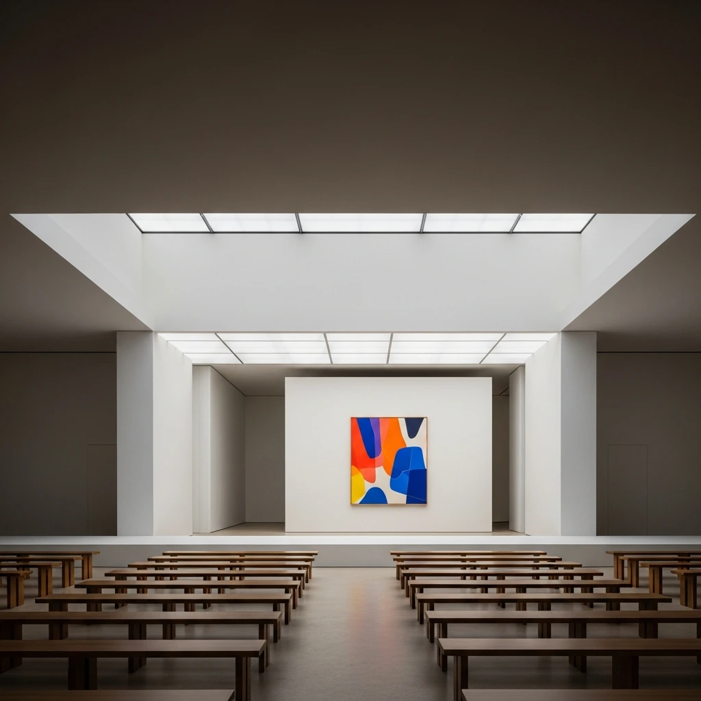
At the heart of this chromatic journey stood a single artwork that set the tone for everything that followed. Ellsworth Kelly’s “Yellow Panel with Red Curve,” painted in 1989, hung at the entrance of the show space at Cité internationale universitaire de Paris. The abstract composition, with its clean geometry and bold color field, became more than mere decoration. It served as a thesis statement for what the designers described as their exploration of clarity, color, and sensual physicality. The painting’s minimalist approach to maximum impact mirrored the collection’s own philosophy.

The Art of Beginning Again
Taking over a heritage house with nearly 180 years of history requires more than technical skill. It demands understanding the delicate balance between honoring tradition and pushing forward. McCollough and Hernandez approached this challenge by returning to fundamentals. Their collection stripped away excess, focusing on essential shapes rendered in striking color combinations that spoke directly to Loewe’s Spanish roots.
The designers referenced the vibrant Mediterranean palette as intrinsic to the house’s identity. Spain’s relationship with color runs deep through its culture, from the bold hues of traditional ceramics to the sun drenched landscapes that define its coastal regions. By channeling this chromatic intensity through a contemporary lens, the duo connected their New York sensibilities with Madrid’s artistic legacy.
Their background at Proenza Schouler, the label they founded over two decades ago while studying at Parsons School of Design, shaped their approach to Loewe. They brought an understanding of American sportswear codes merged with an appreciation for meticulous craftsmanship. This fusion became evident in pieces that looked effortlessly casual yet revealed extraordinary technical complexity upon closer examination.
Primary Colors as Design Philosophy
The decision to center an entire collection around red, yellow, and blue wasn’t arbitrary. These colors carry psychological weight. They’re the building blocks from which all other hues derive. By returning to these origins, McCollough and Hernandez made a statement about stripping fashion back to its essentials. In an era when many luxury brands default to neutrals and safe palettes, primary colors felt radical.
Yellow emerged as particularly significant throughout the collection. From fuzzy wool coats to structured leather pieces, this shade appeared in various textures and applications. It carried an optimism that fashion desperately needed, especially following years of global uncertainty. The color’s presence felt deliberate rather than playful, serious rather than frivolous.
Red arrived with equal conviction. Not the burgundies or wines that typically populate autumn collections, but true, vivid red. Paired with black or white, it created graphic combinations that photographed beautifully while maintaining impact in person. The designers understood that primary red doesn’t need embellishment. Its power lies in its purity.
Blue rounded out the triumvirate, appearing in cobalt iterations that recalled both Mediterranean skies and Kelly’s color field paintings. When combined with black or contrasted against yellow, it demonstrated how primary colors could create sophisticated, adult wardrobes without relying on complex patterns or prints.
Craftsmanship Meets Contemporary Codes
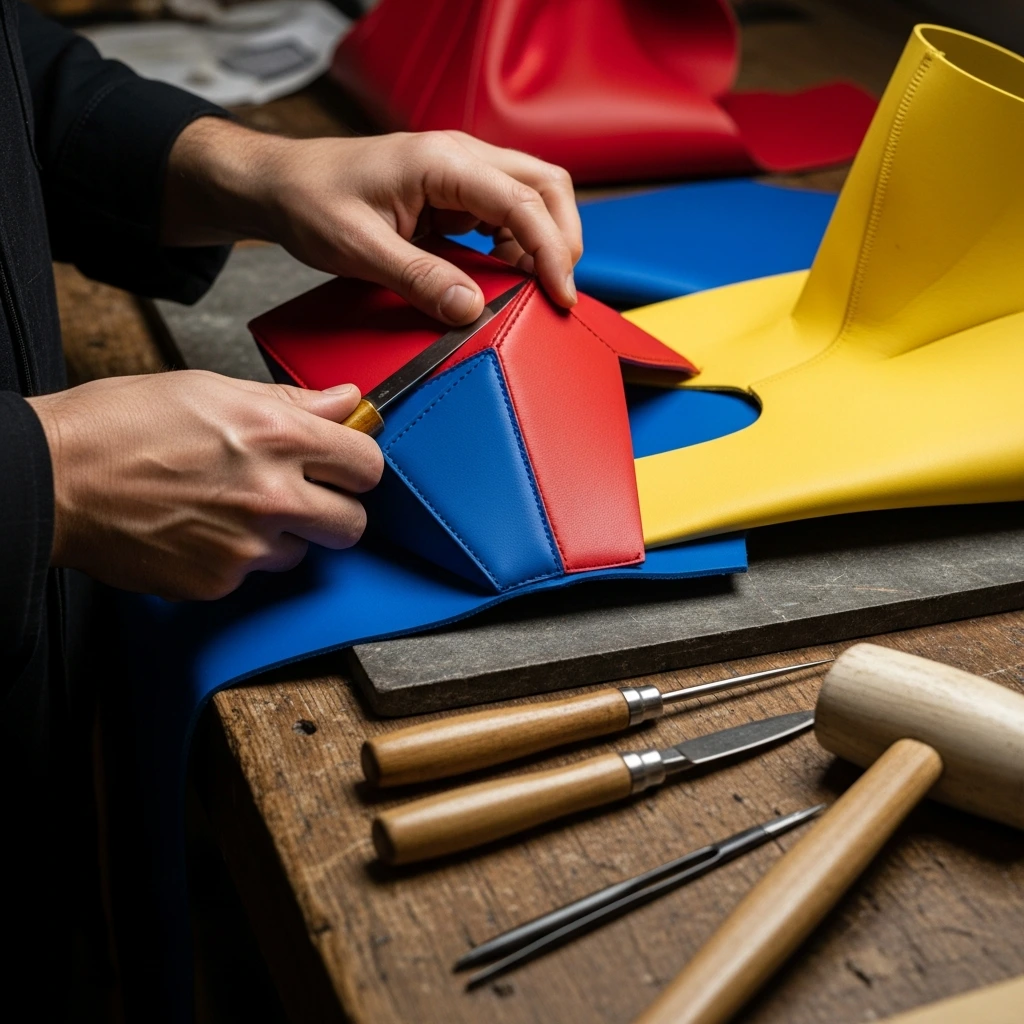
Loewe SS26 reputation rests substantially on its leather expertise. The house began as a collective of leather artisans in Madrid during the nineteenth century, building a legacy around exceptional material quality and innovative construction techniques. McCollough and Hernandez honored this heritage while pushing it into unexpected territories of loewe.
The collection featured leather treated to resemble neoprene, creating sculptural jackets with seamlessly molded constructions. Traditional seams disappeared through advanced skiving techniques, where leather edges are beveled to create invisible joins. These pieces required extraordinary skill, representing hundreds of hours of handwork to achieve what appeared effortless.
Dresses constructed from paneled leather showcased another dimension of technical mastery. Rather than soft, flowing fabrics, these garments held rigid shapes that moved with the body while maintaining their architectural integrity. Some pieces incorporated spray painting techniques onto leather surfaces, creating gradient effects that softened the material’s natural stiffness.
The designers also introduced unexpected materials into Loewe’s vocabulary. Hand blown glass clutches appeared on the runway, their smooth, pebble like forms available in primary colored treatments. These weren’t practical everyday accessories but rather sculptural statements about the intersection of art, craft, and fashion. Similarly, shoes featured origami inspired folds and constructions that challenged conventional footwear design.
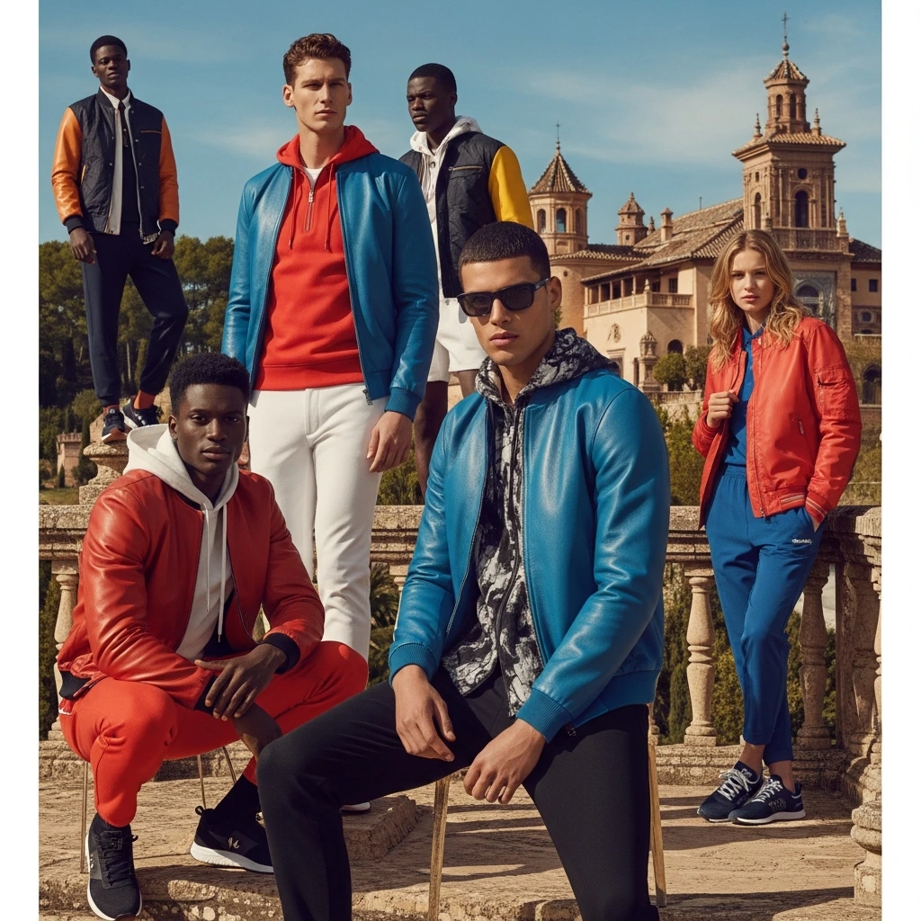
Sportswear Sensibility with Spanish Soul
One of the Loewe SS26 collection’s defining characteristics was its embrace of athletic codes. Bomber jackets, windbreakers, and track inspired pieces appeared throughout, but elevated through material choice and construction methods. A parka might be rendered in luxurious leather rather than nylon. An anorak could feature hand finished details typically reserved for tailored garments.
This sportswear influence aligned with broader cultural shifts. Contemporary luxury increasingly values comfort and ease alongside traditional markers of quality. By incorporating these elements, McCollough and Hernandez demonstrated their understanding of how people actually want to dress. The collection offered clothes that could transition seamlessly from casual to elevated contexts.
The prevalence of shorts, mini dresses, and skirts over traditional trousers reflected another contemporary trend. Several looks featured models in barely there hot pants paired with structured jackets or bomber coats. This trouserless direction felt fresh without being gimmicky, suggesting confidence rather than provocation.
Knitwear received particular attention, with sweaters designed to be worn tied over bare skin or slung casually over shoulders. This styling choice nodded to preppy American codes while maintaining the collection’s sensual undertone. The designers understood that sex appeal in fashion often comes from suggestion rather than exposure, from the space between intention and execution.
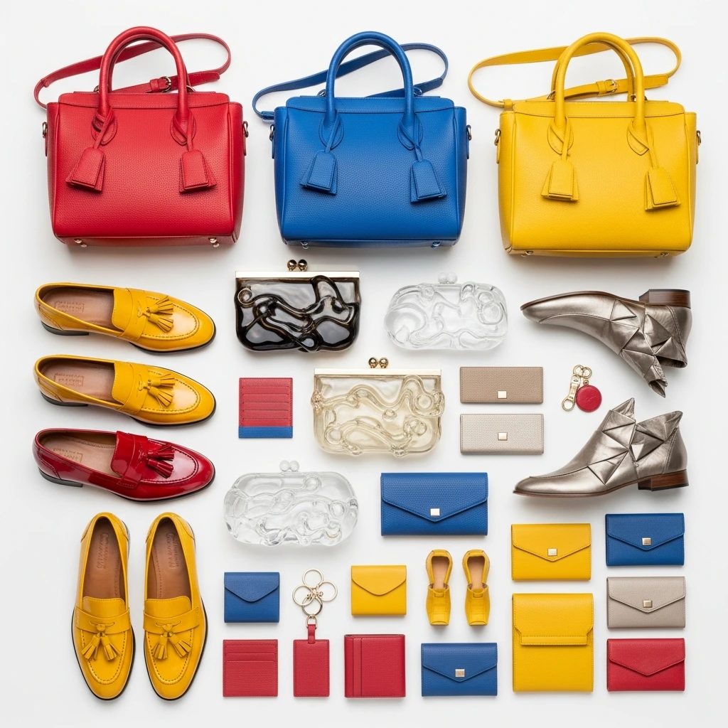
Accessories Tell the Complete Story
Bags have driven much of Loewe SS26 recent commercial success, and McCollough and Hernandez needed to deliver compelling leather goods alongside ready to wear . The Amazona 180 emerged as their signature contribution, reimagining one of the house’s classic silhouettes for contemporary needs.
The new Amazona features a single top handle positioned asymmetrically, allowing the bag’s outer shell to relax away from its inner structure. This intentional slouch gives the piece a casual, lived in quality while maintaining impeccable craftsmanship. Most notably, the bag can be worn open, with interior panels keeping contents secure even when the exterior zip remains undone. This design detail perfectly captured the collection’s balance between ease and precision.
Color played a crucial role in the bag offerings. The Amazona appeared in various primary colored leathers and suedes, from glossy lacquer reds to matte cobalt blues. Some versions featured two tone treatments that echoed the collection’s graphic color blocking. The range suggested versatility, offering options for different moods and occasions while maintaining visual coherence.
Footwear continued the playful experimentation. Tassel loafers came in primary colored glossies, their shine adding another textural dimension. Kitten heels with semi transparent constructions and colorful sockettes created unexpected combinations. These weren’t safe choices. They required commitment from wearers, which felt aligned with the collection’s overall confidence.
The Show Space as Statement
Fashion shows communicate through environment as much as garments. McCollough and Hernandez chose the gardens of Cité internationale universitaire de Paris, erecting a large white box structure reminiscent of previous Loewe presentations. Inside, the space maintained extreme minimalism: white walls, wooden bench seating, and that single Kelly painting.
This stripped back setting allowed the clothes to dominate attention. Without elaborate staging or distracting production elements, viewers focused entirely on silhouette, color, and movement. The approach felt respectful of both the clothes and the audience, trusting that the work itself would prove compelling.
The location itself carried meaning. Cité internationale universitaire houses students and researchers from around the world, representing education, youth, and international exchange. For designers presenting their debut collection, this setting suggested openness to new ideas while honoring tradition through the university’s historic architecture.
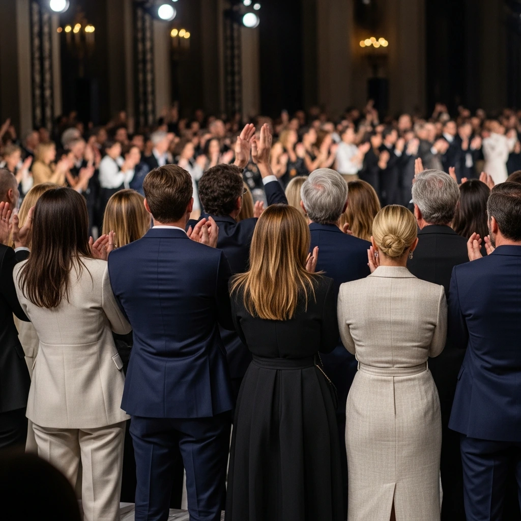
Celebrity attendance included Spanish filmmaker Pedro Almodóvar, actresses Parker Posey and Sarah Paulson, and various international brand ambassadors. Their presence underscored Loewe’s cultural reach beyond pure fashion, positioning the house as relevant to artists, actors, and creative professionals across disciplines.
Reception and Industry Response
The fashion industry’s reaction came swiftly and overwhelmingly positive. Multiple attendees noted the standing ovation that greeted McCollough and Hernandez as they took their bow. This reception felt significant given the scrutiny surrounding major house debuts. The designers had cleared a high bar set by Anderson’s acclaimed tenure while establishing their own distinct voice.
Industry veterans praised the collection’s clarity. After seasons of conceptual fashion that sometimes prioritized artistic expression over wearability, Loewe SS26 offered clothes that people could actually imagine wearing. This didn’t mean the collection lacked ambition or innovation. Rather, it channeled creativity into pieces that balanced aspiration with accessibility.
The commercial implications looked promising. Loewe’s business had multiplied substantially under Anderson, with revenues approaching two billion euros. McCollough and Hernandez needed to maintain this momentum while attracting new customers. Early indicators suggested success on both fronts. The collection offered plenty for existing Loewe SS26 enthusiasts while introducing elements that could appeal to those less familiar with the brand.
Critics noted how the designers navigated their position as Americans leading a Spanish house. Rather than attempting to erase their background, they embraced it, filtering Spanish references through their New York perspective. This cultural exchange felt authentic rather than appropriative, suggesting confidence in their unique position.

What Primary Colors Mean for Fashion’s Future
The emphasis on red, yellow, and blue at Loewe SS26 arrived during a broader industry conversation about color. After years dominated by neutral palettes and quiet luxury aesthetics, designers across fashion weeks began reintroducing bold hues. The timing felt significant. Color represents optimism, energy, and emotional engagement, qualities that resonate after extended periods of uncertainty.
Primary colors specifically carry additional meaning. They’re universal, crossing cultural and linguistic barriers. A child anywhere in the world recognizes and responds to these shades before learning their names. By building a luxury collection around these fundamental hues, McCollough and Hernandez tapped into something primal and accessible simultaneously.
The approach also demonstrated commercial savvy. Primary colors photograph exceptionally well, crucial in an era when fashion lives as much on screens as in stores. They create strong visual identities that help pieces become recognizable even without visible branding. In a crowded marketplace, this distinctiveness offers competitive advantage.
Beyond practical considerations, the color choice reflected philosophical positioning. It suggested that luxury doesn’t require complexity for complexity’s sake. Sometimes the most sophisticated approach involves stripping away excess and celebrating essentials executed with extraordinary skill. This message felt particularly resonant for contemporary consumers increasingly skeptical of overdesign and artificial exclusivity.
Building on Legacy While Looking Forward
Every successful creative transition balances continuity with change. McCollough and Hernandez understood they couldn’t simply replicate Anderson’s approach, nor should they completely abandon what made Loewe successful. Their solution involved identifying core house codes and reinterpreting them through their distinct perspective.
Craftsmanship remained central, with leather techniques that honored Loewe’s heritage. The emphasis on bags acknowledged their importance to the business. Spanish references appeared throughout, from color palettes to cultural touchstones. These elements provided continuity that reassured existing customers and retail partners.
The changes felt equally deliberate. The collection moved away from some of Anderson’s more conceptual flourishes, opting instead for directness. Silhouettes skewed toward athletic and casual codes rather than highly constructed formal wear. The overall mood shifted from witty and surreal to confident and sensual. These weren’t rejections of what came before but rather natural evolutions reflecting different creative voices.
The designers faced unique pressures as independent fashion veterans entering the luxury conglomerate world. Unlike designers who apprenticed at major houses, they built Proenza Schouler from scratch, learning through experience rather than institutional training. This independence shaped their approach, bringing fresh perspectives unburdened by luxury fashion’s often insular conventions.

The Broader Context of Fashion Leadership Changes
Loewe SS26 creative transition occurred during a period of unprecedented movement among major fashion houses. Anderson’s departure to Dior, coupled with changes at other LVMH brands, created a sense of industry wide transformation. This context made the Loewe debut particularly significant as a test case for how heritage houses adapt to new creative visions.
The appointment of American designers to lead a Spanish house also reflected fashion’s increasingly global nature. National identity matters less than creative vision and commercial potential. McCollough and Hernandez’s success at Proenza Schouler demonstrated their ability to build and sustain a brand, skills directly transferable to managing an established house.
Their partnership as both creative collaborators and life partners added another dimension. Fashion has seen various creative duos, but few maintain the longevity that McCollough and Hernandez achieved at Proenza Schouler. This stability suggested they could weather the pressures and demands of leading a major luxury house.
The fashion media’s extensive coverage of their debut reflected broader interest in leadership transitions and their implications for brand direction. In an industry where creative directors increasingly function as celebrities, these changes generate substantial attention and speculation. The generally positive reception of Loewe SS26 likely influenced how other houses approach their own transitions.
Conclusion
Loewe SS26 achieved what all successful debut collections must: it honored the past while establishing a clear future direction. Jack McCollough and Lazaro Hernandez made their case for primary colors not as childish or simplistic but as sophisticated tools for creating emotionally resonant fashion. Red, yellow, and blue became the vocabulary through which they communicated their vision for Loewe’s next chapter.
The collection demonstrated that returning to fundamentals doesn’t mean retreating from innovation. By focusing on color, craft, and clarity, the designers created clothes that felt both timeless and contemporary. They proved that primary colors could anchor an entire luxury collection, providing visual coherence without monotony.
As the fashion industry continues evolving, Loewe’s SS26 direction under McCollough and Hernandez suggests one possible path forward. Their approach balances artistic ambition with commercial awareness, heritage with modernity, accessibility with exclusivity. Whether this becomes a template for other houses remains to be seen, but the standing ovation that concluded their debut indicated they struck a resonant chord.
The serious case for primary colors extends beyond Loewe SS26 Spring Summer 2026 collection. It represents a broader argument about fashion’s purpose and potential. In uncertain times, color offers affirmation. In complex markets, simplicity provides clarity. In an industry often accused of elitism, primary colors speak a universal language. McCollough and Hernandez understood all this, channeling it into a collection that felt both personal and universal, specific to Loewe yet relevant far beyond.
Frequently Asked Questions
Who are Jack McCollough and Lazaro Hernandez?
Jack McCollough and Lazaro Hernandez are American fashion designers who founded Proenza Schouler in 2002 after meeting at Parsons School of Design. They led their namesake brand for over two decades, winning multiple CFDA awards, before being appointed as Loewe SS26 creative directors in 2025. They are partners in both life and work.
What inspired the primary color palette in Loewe SS26?
The collection drew direct inspiration from Ellsworth Kelly’s 1989 painting “Yellow Panel with Red Curve,” which hung at the show entrance. The designers connected Kelly’s chromatic intensity with Loewe’s Spanish heritage and Mediterranean culture, where bold colors hold cultural significance. They described the approach as exploring clarity, vibrancy, and optimism.
What is the Amazona 180 bag?
The Amazona 180 is Loewe’s reimagined version of a classic 1970s house silhouette, named for the brand’s approaching 180th anniversary. It features an asymmetric single top handle that allows the bag to slouch open naturally. The design includes interior panels that secure contents even when the exterior zip remains undone, combining casual ease with refined craftsmanship.
How does the Loewe SS26 collection differ from Jonathan Anderson’s work?
While Anderson’s Loewe often featured surreal, conceptual elements, McCollough and Hernandez brought a more straightforward, wearable aesthetic with sportswear influences and New York sensibility. They maintained Loewe’s commitment to craftsmanship and leather expertise but shifted toward cleaner lines, athletic codes, and bold color blocking rather than whimsical experimentation.
What makes primary colors significant in luxury fashion?
Primary colors represent a return to fundamentals in an industry often dominated by neutrals and complex palettes. They photograph exceptionally well for digital platforms, create strong brand recognition, and carry universal appeal across cultures. In luxury fashion specifically, using pure red, yellow, and blue demonstrates confidence that simplicity, when executed with extraordinary skill, can be more sophisticated than complexity.
2 Comments